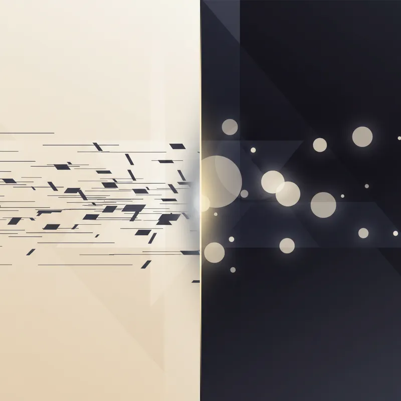
The debate, finally tested in the wild
Dark mode looks cool and can feel gentler at night—but does it quietly shave a few words per minute off your typing? Decades of human–computer interaction and vision research suggest a consistent “positive‑polarity advantage”: people read and proofread better when text is dark on a light background (positive polarity) than when it’s light on a dark background (negative polarity). We’re bringing that claim out of the lab and into your browser with a large‑scale typing experiment. (psychologie.hhu.de)
Here’s the plan, the science behind it, and how you can tune your theme for both speed and comfort right now.
What the research says about contrast polarity
- Positive polarity = dark text on a light background; negative polarity = light text on a dark background.
- Multiple experiments report better proofreading and higher legibility in positive polarity. One mechanism is optics: brighter screens constrict your pupils, sharpening the retinal image and making small details (like punctuation) easier to resolve. In controlled tasks, smaller pupils correlated with fewer missed errors and more words read. (pubmed.ncbi.nlm.nih.gov)
- Ambient light matters. Under dim surroundings, the positive‑polarity advantage is especially apparent; in brighter rooms, the gap can narrow. (sciencedirect.com)
In short: for many reading‑heavy tasks, light themes tend to be faster and more accurate—not because of fashion, but because of how eyes work. (psychologie.hhu.de)
Where astigmatism changes the story
If you have astigmatism, white‑on‑black text can appear “glowy” or fuzzy (halation), which can slow you down or increase errors—especially at smaller font sizes or in dim rooms. Consumer eye‑health guidance and clinical resources note this effect, and it maps neatly onto the pupil‑size explanation above: dark mode often dilates pupils, which can exaggerate optical aberrations like astigmatism. (allaboutvision.com)
Astigmatism is common. Analyses of U.S. population data (NHANES) report roughly 31% prevalence among adults 40+, which means a huge chunk of typists may be especially sensitive to polarity choices. (ncbi.nlm.nih.gov)
Our live experiment: dark mode vs light mode, measured on real typing
We’re rolling out a transparent, privacy‑respecting A/B test so we can answer the WPM question with real‑world data:
- Randomization: Each test session gets either light (positive) or dark (negative) by default. Users can still switch—but the first exposure is randomized to avoid self‑selection bias.
- Segmentation: We’ll ask two optional questions: age band (e.g., 13–24, 25–39, 40–54, 55+) and “Do you have diagnosed astigmatism?”
- Metrics: WPM (gross and net), accuracy (%), error types (substitutions, omissions, transpositions), and time‑to‑first‑error.
- Controls: We balance text difficulty and length, rotate passages, and model learning effects across repeated sessions. We’ll also let users self‑report ambient lighting (bright/normal/dim) so we can examine the interaction with polarity. Prior work suggests the advantage is strongest in dim light. (sciencedirect.com)
- Statistics: We’ll use mixed‑effects models (participant as a random effect; theme, age, ambient light, and astigmatism as fixed effects). With tens of thousands of sessions, we can detect even small differences (e.g., a 1–2 WPM shift) with high confidence.
Hypotheses we’re testing
- H1: On average, positive polarity yields higher WPM and accuracy than negative polarity.
- H2: The positive‑polarity advantage is larger for users who report astigmatism.
- H3: The advantage grows under dim ambient light and shrinks under bright light. (psychologie.hhu.de)
We’ll publish the anonymized aggregate results, the analysis code, and a short technical note so other typing sites and educators can replicate the findings.
Practical tips you can use today
Whether you’re chasing a personal best or writing a term paper, these settings can nudge your speed and reduce errors:
- If clarity matters, start with light mode.
- Use an off‑white background (e.g., #FAFAF7) with very dark gray text (#111 or #1A1A1A). This keeps contrast high while avoiding “paper white” glare. Studies attribute better proofreading to smaller pupils under brighter displays. (pubmed.ncbi.nlm.nih.gov)
- If you prefer dark mode, tame halation.
- Avoid pure black backgrounds and pure‑white text. Try a near‑black background (#0B0B0D–#121212) with slightly warm off‑white text (#E6E3DC). Increase body text weight one step (e.g., 400→500) and add a touch more line height and letter‑spacing to stabilize glyph shapes. These tweaks reduce glow on edges that can bother users with astigmatism. (allaboutvision.com)
- Match your room lighting.
- In dim rooms, add a soft bias light behind your display or nudge the background lighter; in bright rooms, reduce overall screen brightness and keep reflections off the glass. The polarity gap tends to widen when the room is dark. (sciencedirect.com)
- Make the text easier to resolve at speed.
- Favor humanist or neo‑grotesque sans‑serifs with open apertures, avoid ultra‑thin weights, and increase size a notch for longer sessions. For dark themes, bold slightly more than you would on light ones. These are consistent with applied legibility guidance when negative polarity is unavoidable. (sciencedirect.com)
- If you have astigmatism (diagnosed or suspected):
- Try light mode first, then fine‑tune brightness and background from stark white to warm off‑white. If dark mode causes “halo” or double edges, back off to a soft dark gray background and warmer text. Many users with astigmatism report better clarity this way, and clinical guidance notes halation is more common with white‑on‑black. (allaboutvision.com)
Theme presets we’ll publish with the results
- Speed‑first (Light): background #FAFAF7, text #111, link #0B57D0, line‑height 1.55, letter‑spacing 0.2 px.
- Night‑owl (Soft Dark): background #121212, text #E6E3DC, muted UI #2A2A2A, body weight 500, line‑height 1.6, letter‑spacing +1%.
- Astigmatism‑friendly (Paper): background #F5F2EB, text #141414, headings 600, body 18–19 px, strong focus rings to reduce visual search.
What we expect—and why we’re testing anyway
Given the lab evidence, we expect many typists to gain a small but measurable WPM and accuracy boost in light themes, with a larger effect among users who report astigmatism and those typing in dim rooms. But preference, hardware, and environment all matter—so instead of declaring a winner, we’ll publish data, presets, and guidance you can actually use. Watch this space for an update with effect sizes by age and astigmatism status, plus downloadable themes.
Key takeaways
- Positive polarity likely improves legibility and error detection via smaller pupils and sharper retinal images. (pubmed.ncbi.nlm.nih.gov)
- The advantage is strongest in dim light and may be especially helpful for people with astigmatism, who often experience halation with white‑on‑black. (sciencedirect.com)
- Our site‑wide A/B test will put this to the test for typing speed and accuracy, and we’ll share the results and recommended presets publicly.